Rebuilt site architecture and UI for clearer journeys—navigation, categories, product cards, and filters—keeping brand style while reducing clutter and making product choice obvious
Rebuilt site architecture and UI for clearer journeys—navigation, categories, product cards, and filters—keeping brand style while reducing clutter and making product choice obvious
Goal
Make the site clear, usable, and modern—structure aligned with company values without blocking product choice

Shift focus from overloaded navigation to content while keeping brand colors
Problem
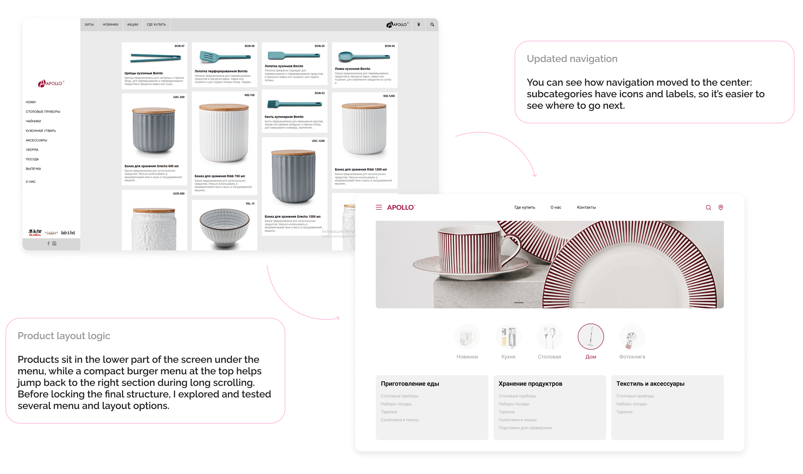
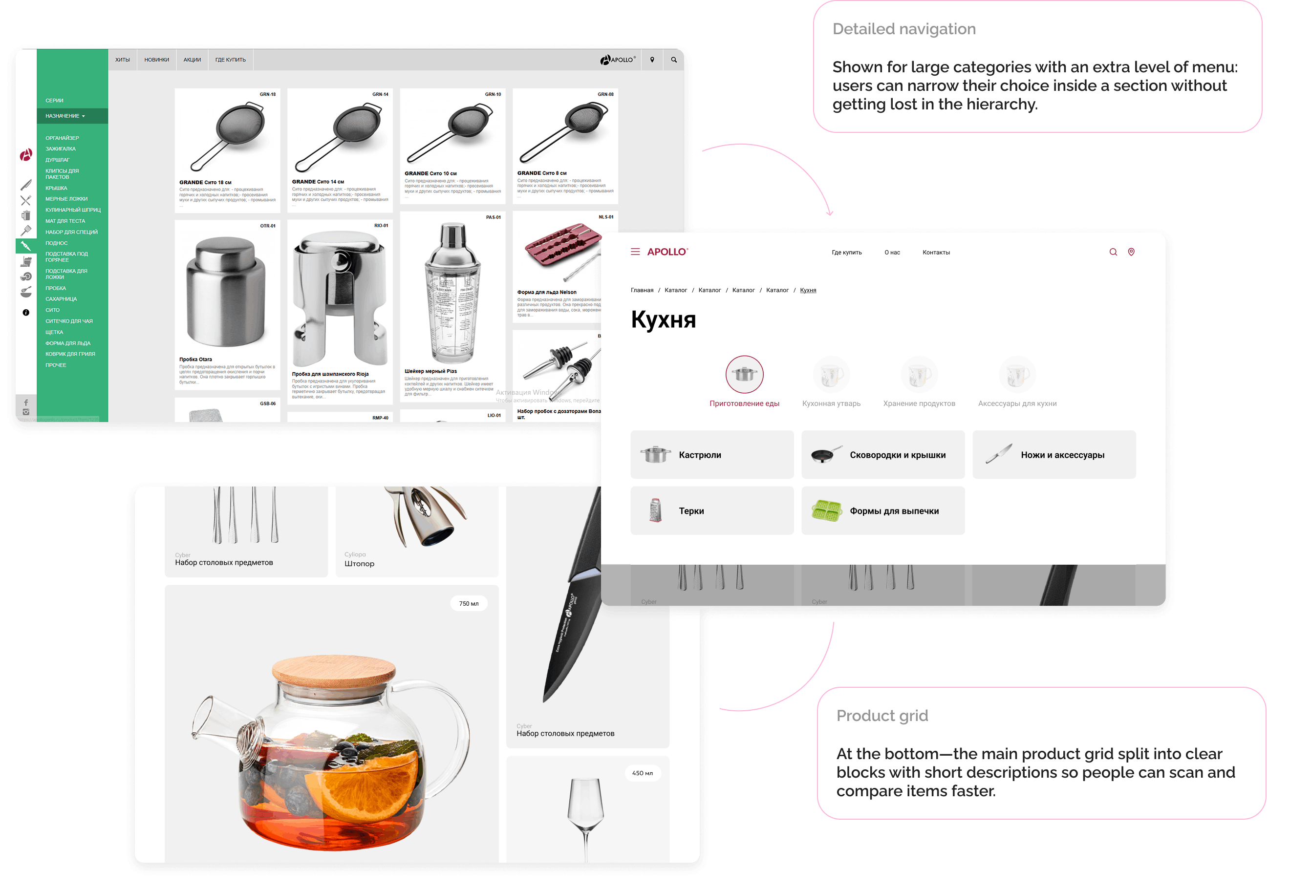
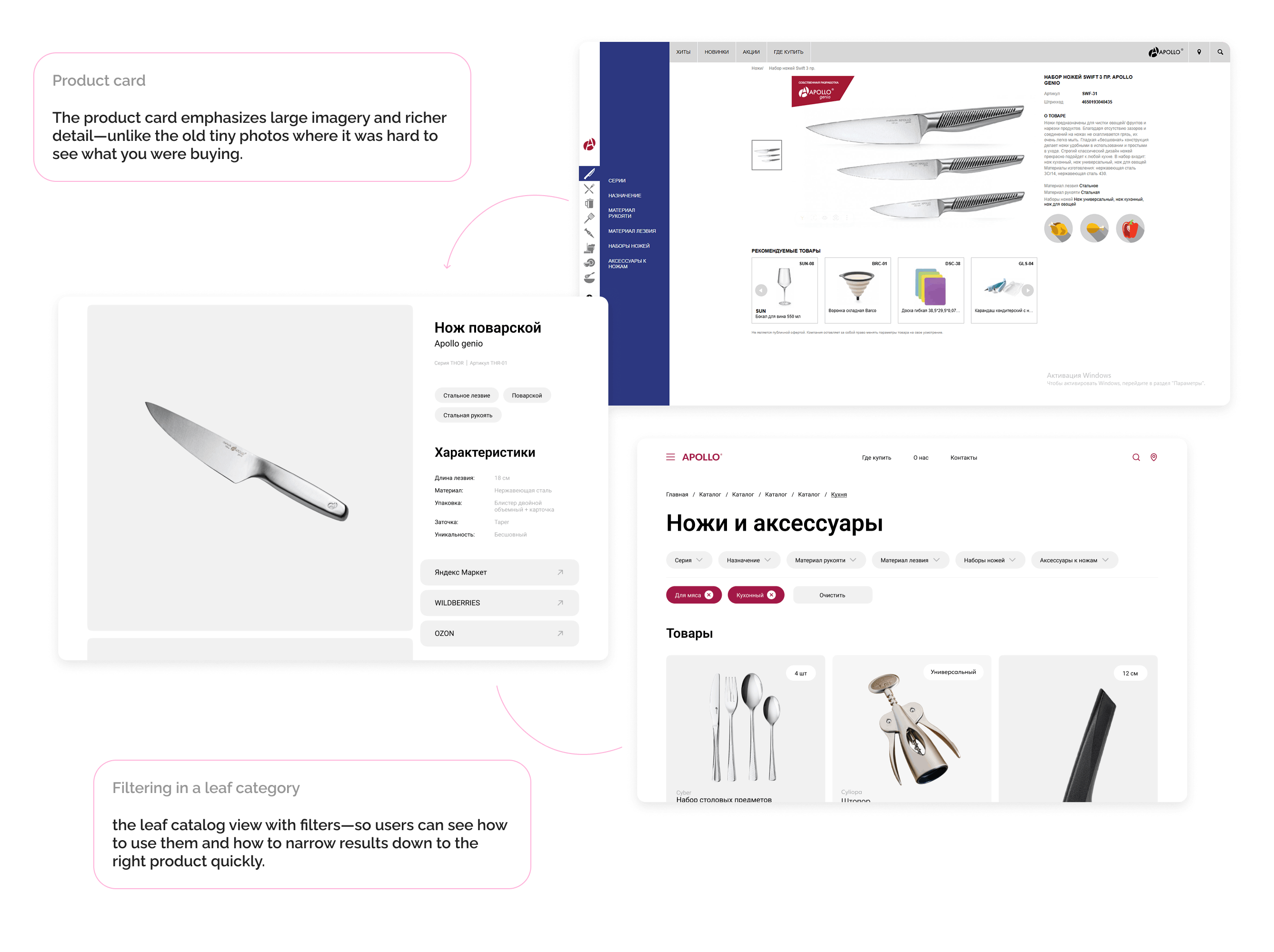
Legacy UX: unclear navigation, images without captions in places, crowded side menu, and little room to showcase the brand and product content
Users spent time hunting sections and did not always see how to reach a category or product
Result
Delivery-ready site design with cleaner structure—navigation, filters, detailed cards, and better content rhythm
Marketplace shortcut cards so users can jump straight to purchase